On Friday, the U.S. Bureau of Labor Statistics (BLS) released their monthly jobs report. As has been widely reported, the net new jobs created blew through expectations at 303,000 net new jobs in March. The better-than-expected jobs number begs the question – How healthy is the American labor market? Here are five charts to address that question.
The Broad Picture
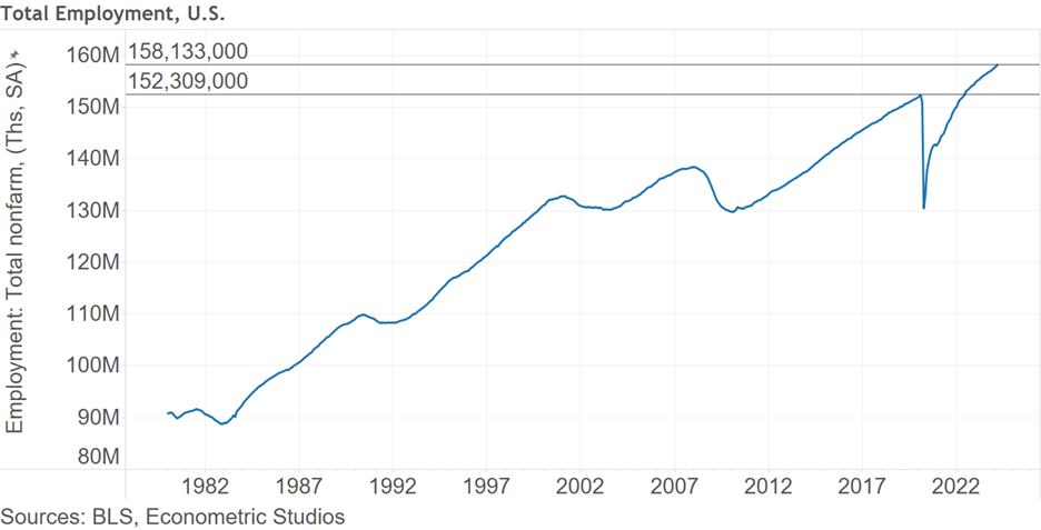
First, the broad picture. There are 158,133,000 employed individuals in the United States (seasonally adjusted). This is up from the pre-pandemic February 2020 count of 152,309,000. Although there are problems with the American labor picture, it could be much worse.
The Labor Force Participation Picture
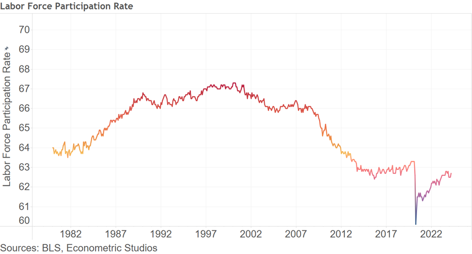
Another gauge of American labor picture is labor force participation. At 62.7%, the working age population is still behind where labor force participation stood in February 2020 at 63.3%. On the one hand, this suggests there’s room for further employment expansion, while on the other hand it perhaps suggests that fewer Americans want to work the jobs that await them in the labor market.
The Full-time and Part-time Employment Picture
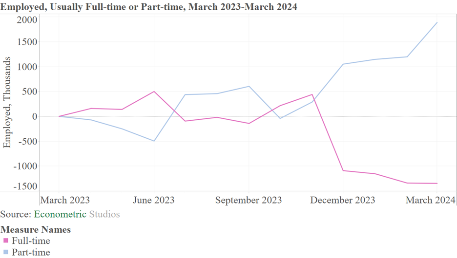
A third view of the American labor picture is the reporting of individuals saying they usually work full-time and those that report usually working part-time. According to the Household Survey (a survey by the BLS of a sample of U.S. households), since 2023, the number of individuals reporting they usually work full-time is down 1.347 million. By contrast, the number of individuals reporting usually working part-time is up 1.888 million. The drop in full-time employment began in December 2023, at the same time that part-time work started rising quickly. All being said, this does not necessarily suggest a downturn in economic conditions is imminent, but it does suggest caution.
The Wage Picture
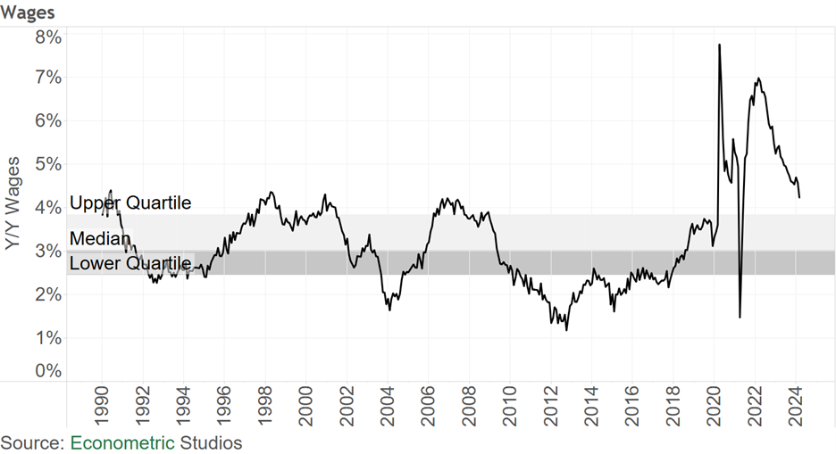
The fourth chart is the wage picture. Year-over-year growth in wages stood at 4% in March, down from the March 2022 peak of 7%. Although wages are trending down, growth in wages at 4% is still well above what would be comfortable for Federal Reserve policymakers, whose job it is to bring inflation down to 2% (preferably 0). The wage picture suggests there’s still a long way to go.
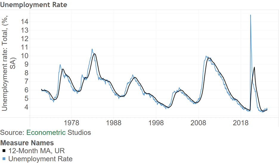
The Unemployment Picture
The fifth view is the unemployment picture. Shown in the figure below is the BLS’ reported unemployment rate with its 12-month moving average. Overall, the U.S. unemployment rate dropped from 3.9% in February to 3.8% in March. Of a bit of concern, the unemployment rate has been floating above its 12-month moving average for almost a year now (since May 2023). Typically, when the actual unemployment rate floats above its 12-month moving average, the U.S. is either in a recession or is on the cusp of entering one. This measure is worth watching.
Summing Up
Overall, the American employment picture is relatively healthy, with employment at an all-time high even though full-time employment has been trickling down over the past year. To some, the jobs picture may look like we’re at peak employment, whereas to others the employment market is hitting a healthy cruising speed. The coming months will give us more tell on what the true story is.

Comments on this entry are closed.